02
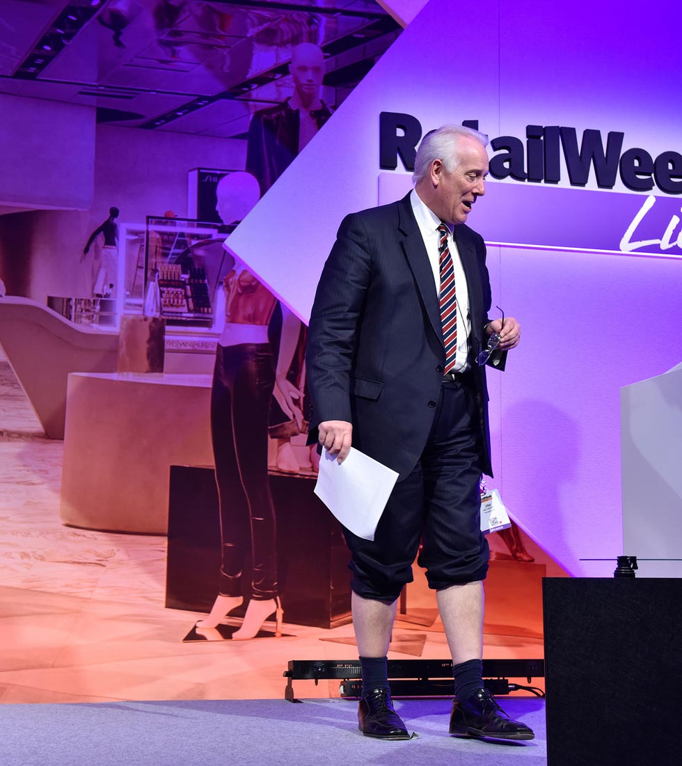
Connect yourself, lead your business, inspire your customers
Over the last quarter of a century Retail Week Live has provided the environment for retail’s brightest minds to connect, find inspiration and advance the sector
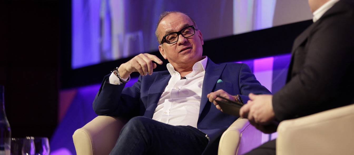
Event for the retail industry
There is something about asymmetric layouts that I like a great deal. It seems to make a design almost always more interesting to look at, and sort of unique. And can also help guide a user through content.
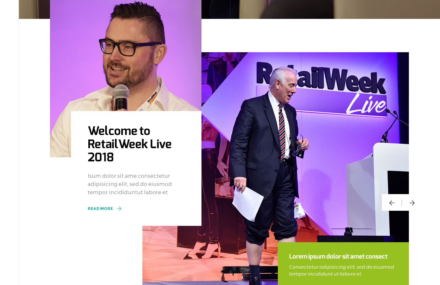
For the Retail Week homepage mockup, I tried to do just that on a small scale and include a degree of asymmetry to a couple of sections.
Note: This design contains stock photography images, some of which may have been used in other projects of mine.
Brand colours
- 97c120 (Citron)
- 00a99d (Persian Green)
Typeface
- Header: Exo
- Body: Montserrat
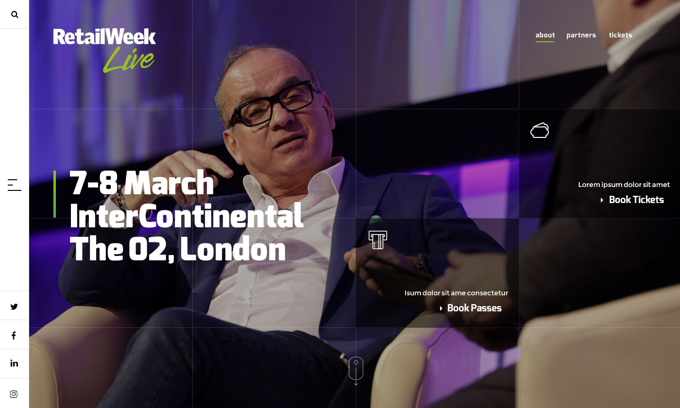
Homepage hero (video background)
Featured article + slider
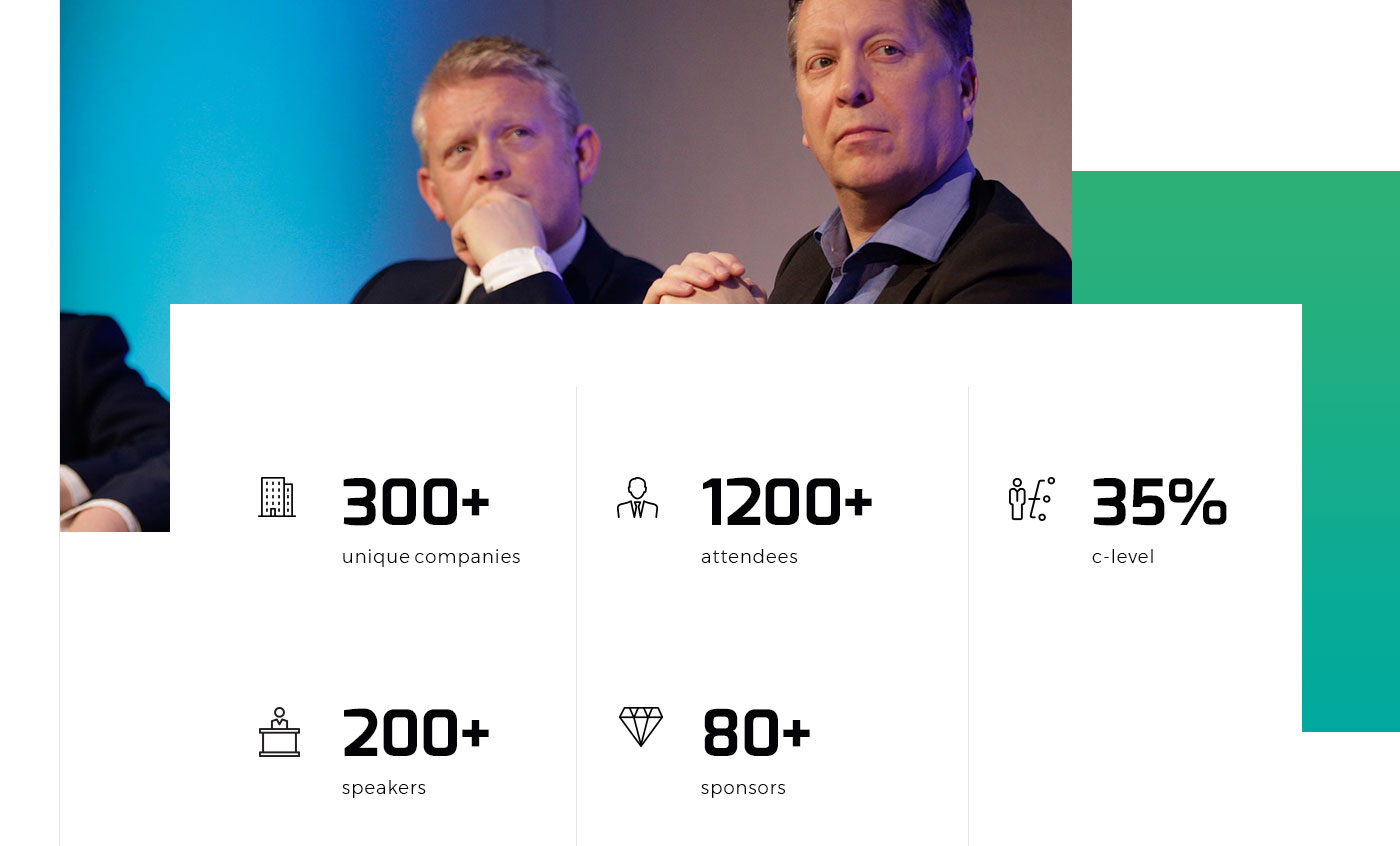
Show stats
Article style
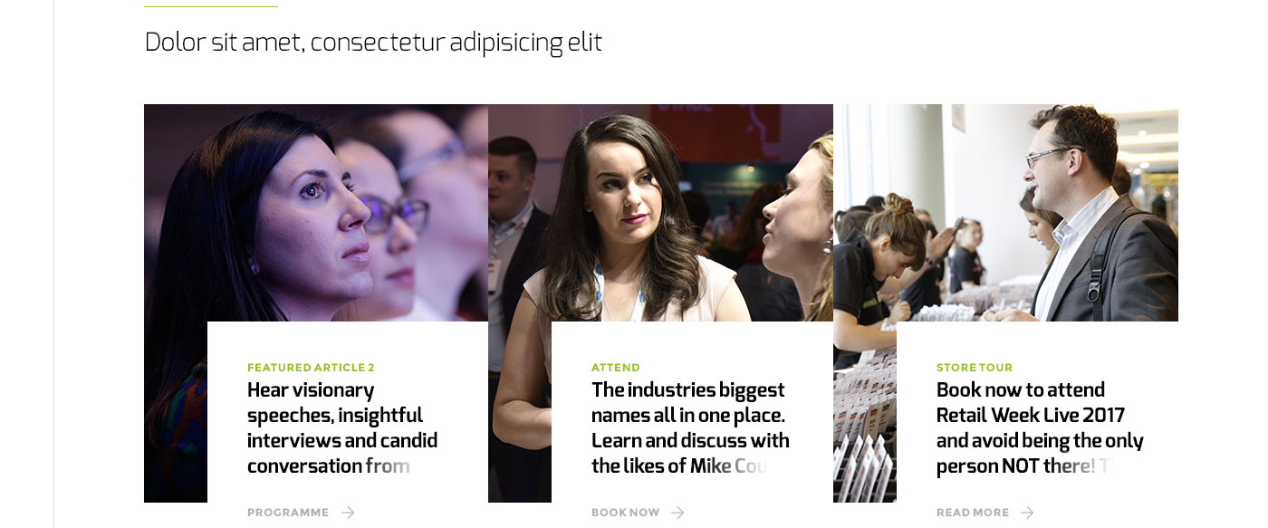
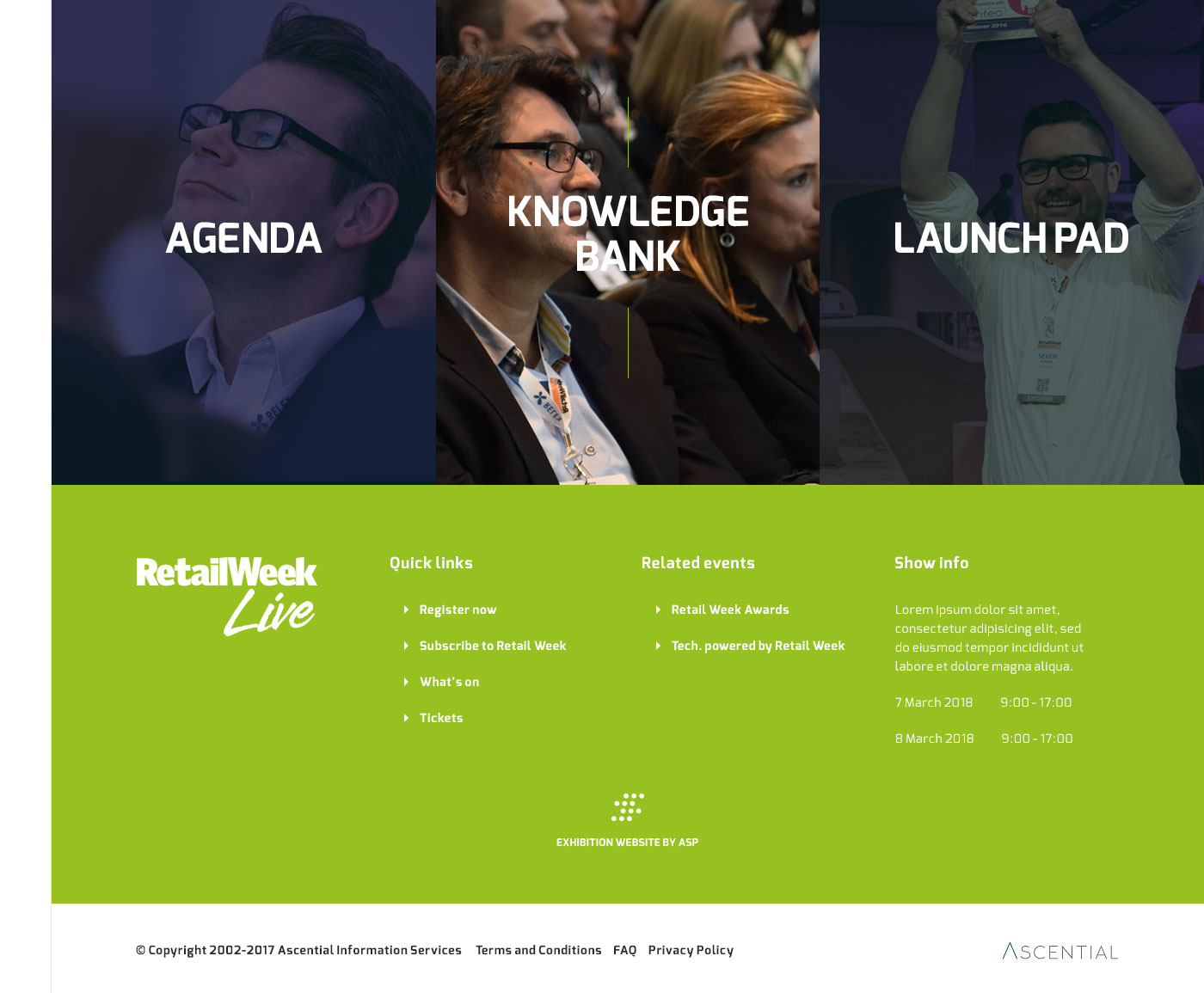
Main calls to action + footer
